
Mobile eCommerce Best Practices
- Why Mobile eCommerce Matters
- User-Friendly Checkout Process
- Personalization and Recommendations
In today's fast-paced digital age, mobile devices have become the go-to option for online shopping. Whether it's a quick browse during a coffee break or an impulse buy while watching TV, mobile eCommerce has reshaped the retail landscape. Here's how to optimize your mobile eCommerce site effectively.
Why Mobile eCommerce Matters
Mobile devices dominate eCommerce traffic, making mobile optimization essential for any online business. Implementing best practices in mobile eCommerce can enhance conversion rates, improve customer satisfaction, and boost sales. With more people shopping on their phones, providing a smooth mobile experience is crucial to staying competitive.
Responsive Design
Responsive design in eCommerce ensures your website looks and functions well on any device. Key actions include:
- Using CSS Media Queries: To adjust layout and content based on screen size
- Flexible Grid Layouts: Adapting the site's structure for various devices
- Responsive Images: Ensuring images scale appropriately to different screen sizes
- Viewport Meta Tag: Configuring the viewport for mobile devices to display pages correctly
Fast Loading Times
Speed is critical for user retention and conversion in eCommerce. Even a one-second delay can reduce conversions by 7%. To optimize your site's speed, focus on image optimization, leverage browser caching, and minimize redirects. These steps are key components of mobile commerce best practices. Faster loading times enhance the user experience and improve your site's search engine ranking. Remember, in eCommerce every second counts. To optimize your site's loading times:
- Compress Images: Use tools like ImageOptim or TinyPNG
- Minimize HTTP Requests: Combine CSS and JavaScript files
- Enable Browser Caching: Store static files locally for faster loading
- Reduce Server Response Time: Optimize server performance and reduce latency
- Use Content Delivery Networks (CDNs): To distribute content globally and reduce load times
Simplified Navigation
Effective navigation in mobile eCommerce enhances user experience, particularly on smaller screens. Navigating a website on a small screen can be challenging. A well mobile ecommerce design includes a clear menu, easily accessible categories, and a prominent search bar. Implementing a sticky header or menu keeps navigation options available as users scroll through your site. This feature is particularly beneficial for large inventories. The goal is to make it easy for users to find what they're looking for, thereby enhancing the overall ecommerce UX trends.
User-Friendly Checkout Process
A streamlined checkout process can significantly reduce cart abandonment. Key actions include:
- Multiple Payment Options: Offer credit cards, PayPal, mobile wallets, etc.
- Guest Checkout Option: Allow purchases without requiring account creation
- Auto-Fill Forms: Utilize browser and payment provider features to fill in customer details
- Progress Indicators: Show customers the steps remaining in the checkout process
- Simplified Forms: Collect only necessary information and use single-column layouts
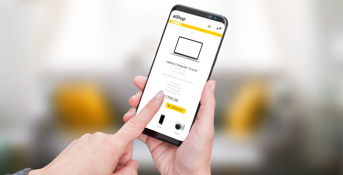
Optimized Product Pages
ECommerce product pages should be informative and visually appealing. Optimize them by:
- Using High-Quality Images: Provide multiple images and allow zoom functionality
- Detailed Product Descriptions: Include specifications, sizes, and other important details
- Customer Reviews and Ratings: Display user feedback to build trust
- Clear Call-to-Action Buttons: Encourage users to add items to their cart or wishlist
- Related Products Section: Suggest complementary or alternative products
These eCommerce strategies, informed by mobile UX research, help customers make informed purchasing decisions, increasing their confidence and likelihood of buying.
Personalization and Recommendations
Personalization is a useful tool in eCommerce world. You can increase engagement and sales by tailoring the shopping experience to individual users. But how do you do this on mobile?
Use past purchases, browsing history, and user behavior to make product recommendations. Push notifications can tell customers about sales or new products they might like. Customers can feel valued by personalized experiences, which can lead to increased mobile eCommerce sales.
Mobile SEO Best Practices
Optimizing for mobile search engines is crucial for attracting traffic in mobile eCommerce. Focus on:
- Mobile-Friendly Design: Ensure your site passes Google's mobile-friendly test
- Accelerated Mobile Pages (AMP): Use AMP to enhance loading speeds on mobile devices
- Schema Markup: Implement structured data for better search engine understanding
- Optimize Meta Tags: Tailor meta titles and descriptions for mobile search
- HTTPS: Secure your site with HTTPS to improve ranking and build trust
Security and Trust
Security is a paramount concern for online shoppers especially in eCommerce. Implement these measures:
- Secure Payment Gateways: Use reputable providers like Stripe or PayPal
- Authentication Protocols: Implement strong password policies and MFA
- Data Encryption: Use SSL/TLS certificates to encrypt data in transit
- Regular Security Audits: Perform vulnerability assessments and penetration testing
- Frequent Software Updates: Keep all eCommerce systems and plugins updated
- Firewall and WAF: Protect against DDoS attacks and malicious traffic
- Secure APIs: Ensure all APIs are securely configured and authenticated
- Session Management: Implement secure session handling and auto-logout features
- Monitoring and Logging: Track and log access to detect and respond to suspicious activities

Testing and Analytics
Continuous testing and analytics are essential for optimizing a mobile eCommerce site. Implement A/B testing to compare different web page versions and identify the most effective design elements. Utilize heatmaps and user recordings to gain insights into user behavior and navigation patterns. Use tools like Google Analytics to monitor key metrics such as traffic sources and conversion rates, providing valuable data for decision-making. Focus on Conversion Rate Optimization (CRO) to enhance the user experience and reduce friction points. Regular usability testing with real users helps identify and resolve potential issues, ensuring the site remains user-friendly and effective.
In our fast-paced world of mobile eCommerce, staying competitive means implementing best practices that enhance user experience, boost conversion rates, and secure customer trust. From responsive design to a streamlined checkout process, every detail counts. Ready to elevate your mobile eCommerce site and drive more sales? Reach out to us today, and let's create a mobile shopping experience that sets your business apart.
What you also need to read
-
 How to build a successful eCommerce website (part 1)
Key Points to Help You Build a Successful eCommerce Website in 2022 (team)
How to build a successful eCommerce website (part 1)
Key Points to Help You Build a Successful eCommerce Website in 2022 (team) -
How to build a successful eCommerce website (part 2)
Key Points to Help You Build a Successful eCommerce Website in 2022 (project workflow)
-
Comprehensive site audit
Take your online business to the next level!


Leave your comment